FASTR
Creating the "Cool Kid" of United Kingdom's hospitality and event staffing industry.
Brand Strategy, Brand Naming, Visual Identity, Marketing Campaign
FASTR
Creating the "Cool Kid" of United Kingdom's hospitality and event staffing industry.
Brand Strategy, Brand Naming, Visual Identity, Marketing Campaign
FASTR
Creating the "Cool Kid" of United Kingdom's hospitality and event staffing industry.
Brand Strategy, Brand Naming, Visual Identity, Marketing Campaign
Context
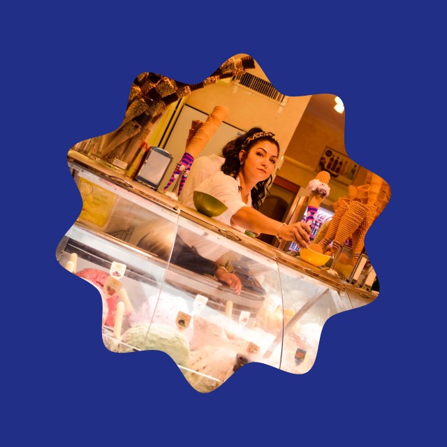
The hospitality and event staffing industry is an old mans barnyard where it takes grit, experience, connection and a willing workforce to make a difference. So when the founders of “Find A Shift Today” approached me to create a brand system, It was clear that we needed to find a way to make the visual system diverse and functional to appeal to the mass audience and also the events they would be sourcing these jobs from.
Context
The hospitality and event staffing industry is an old mans barnyard where it takes grit, experience, connection and a willing workforce to make a difference. So when the founders of “Find A Shift Today” approached me to create a brand system, It was clear that we needed to find a way to make the visual system diverse and functional to appeal to the mass audience and also the events they would be sourcing these jobs from.

Strategy
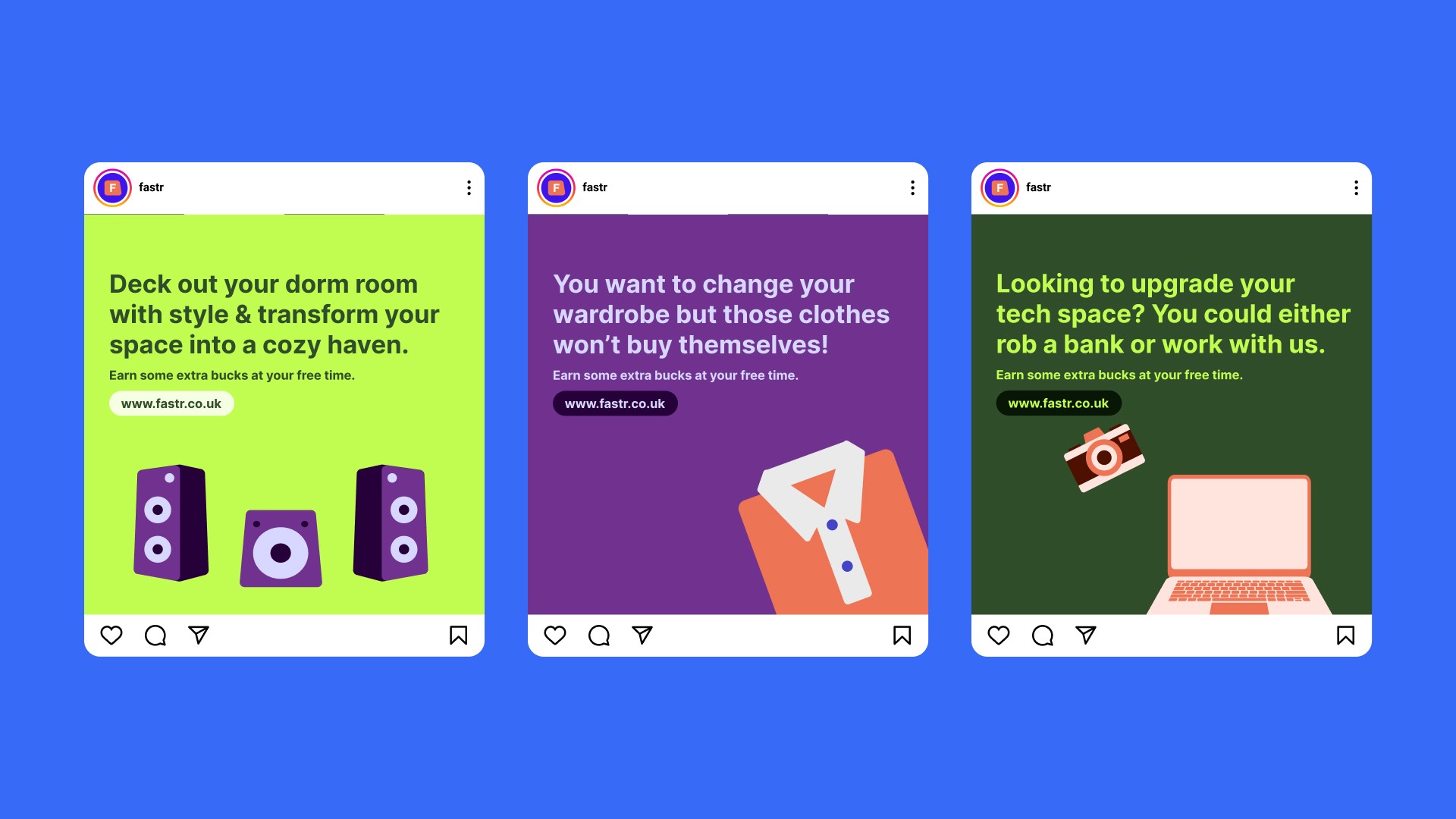
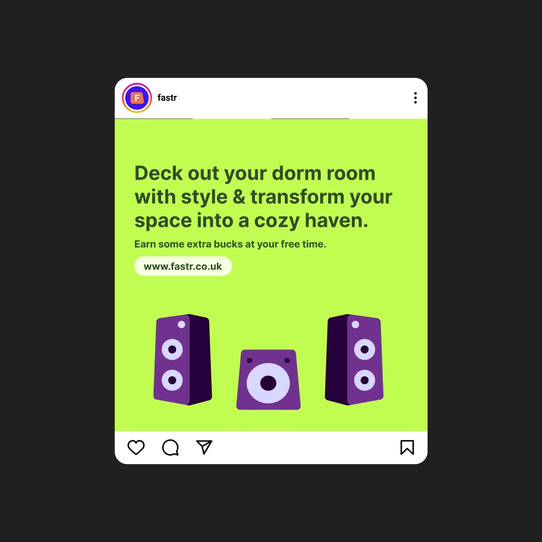
We first began with a brand strategy session to narrow down the initial users to university students that we could instantly resonate with and then we had to find a better name for the company, finally, we delved into creating a unique visual system with quirky attributes but still grounded in the roots of professionalism.
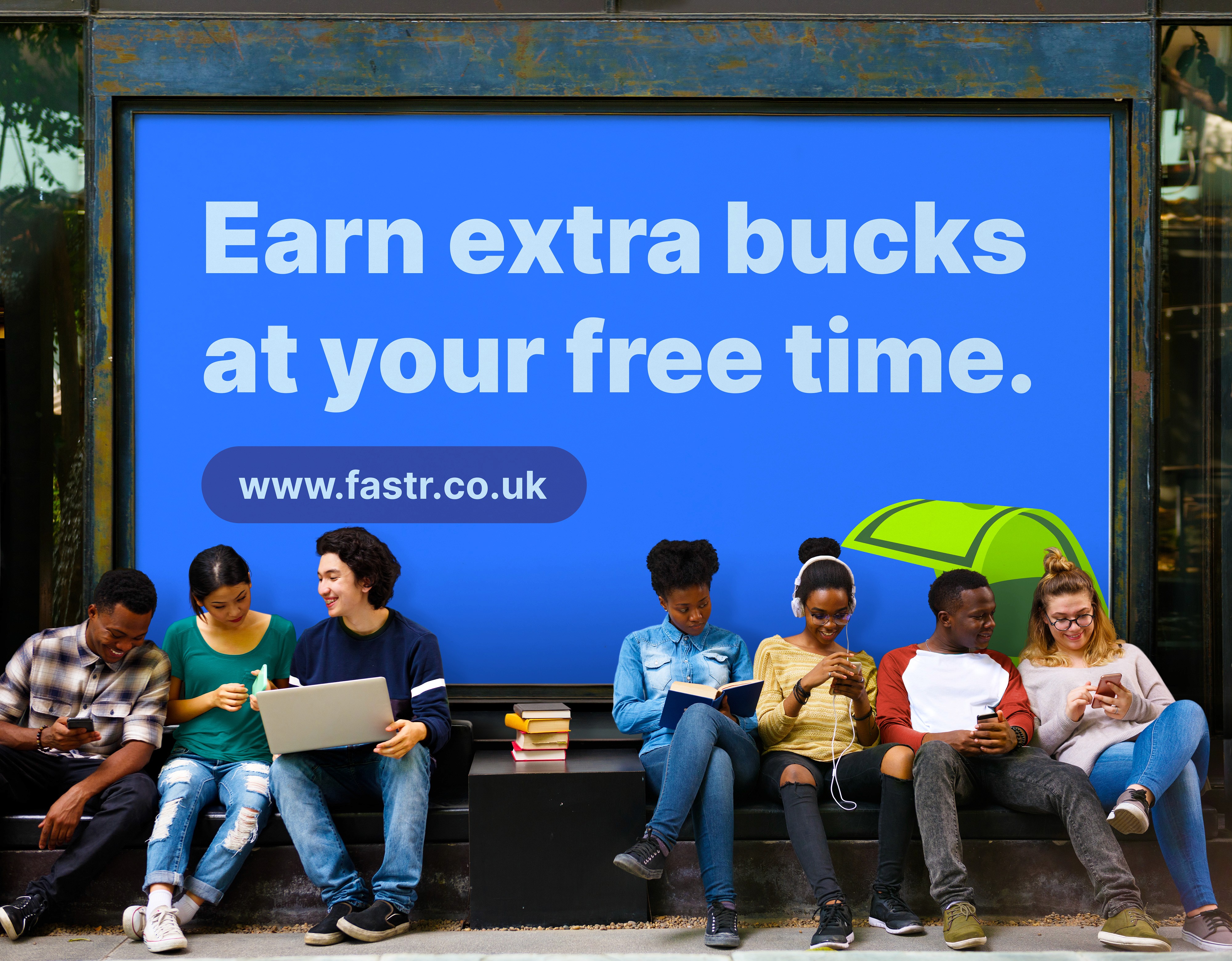
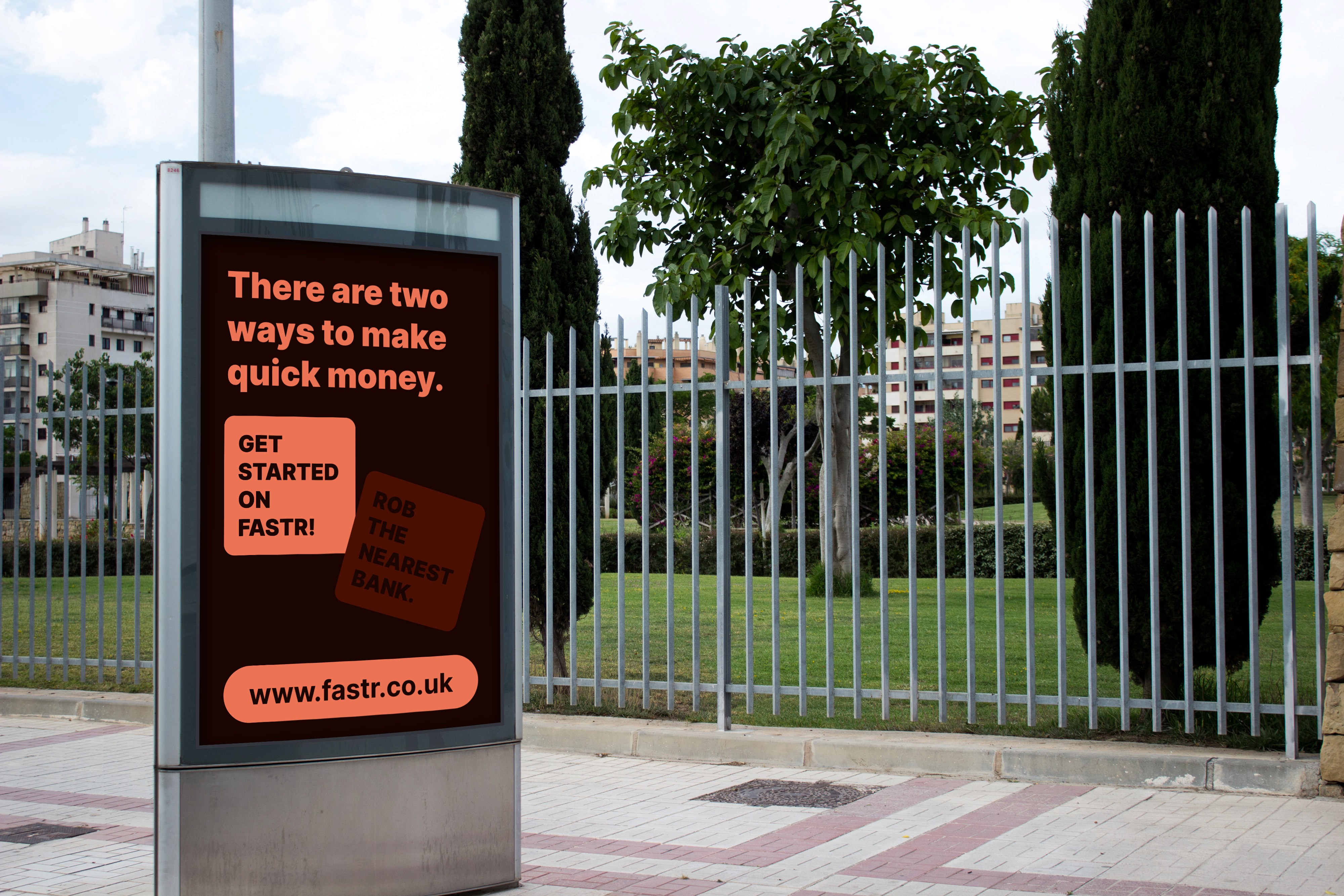
We rounded up with creating a marketing campaign targeted at the university students and created the visuals to accompany this campaign.
Design
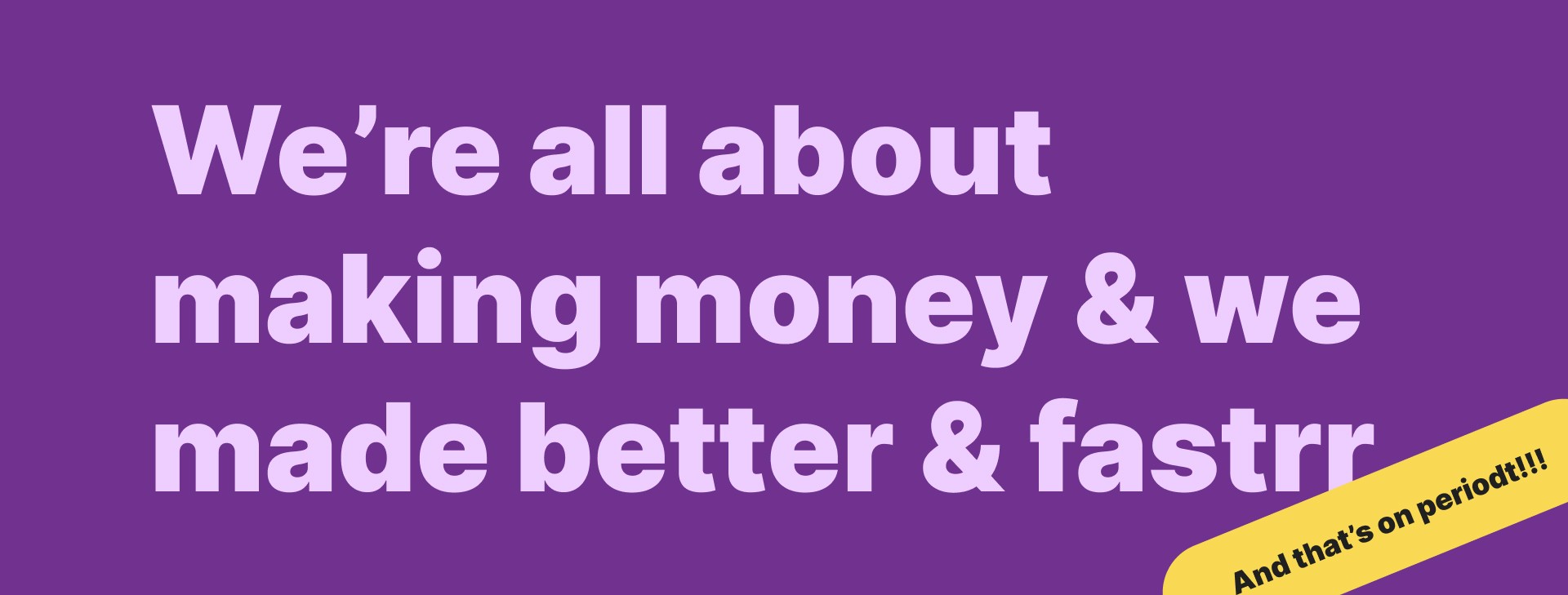
The underlying visual language was created with the idea of enabling transitioning quickly between being friendly and being professional.
We had to avoid straight up boring edges and also not go overboard with overly playful curves. We decided to settle on being more titled to the playful and jovial aspects but with simple curved edges and try to establish balance as much as possible.
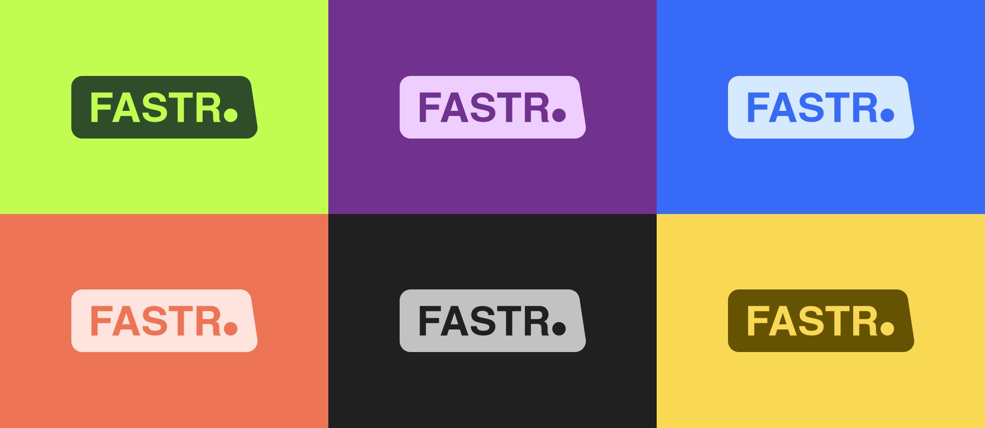
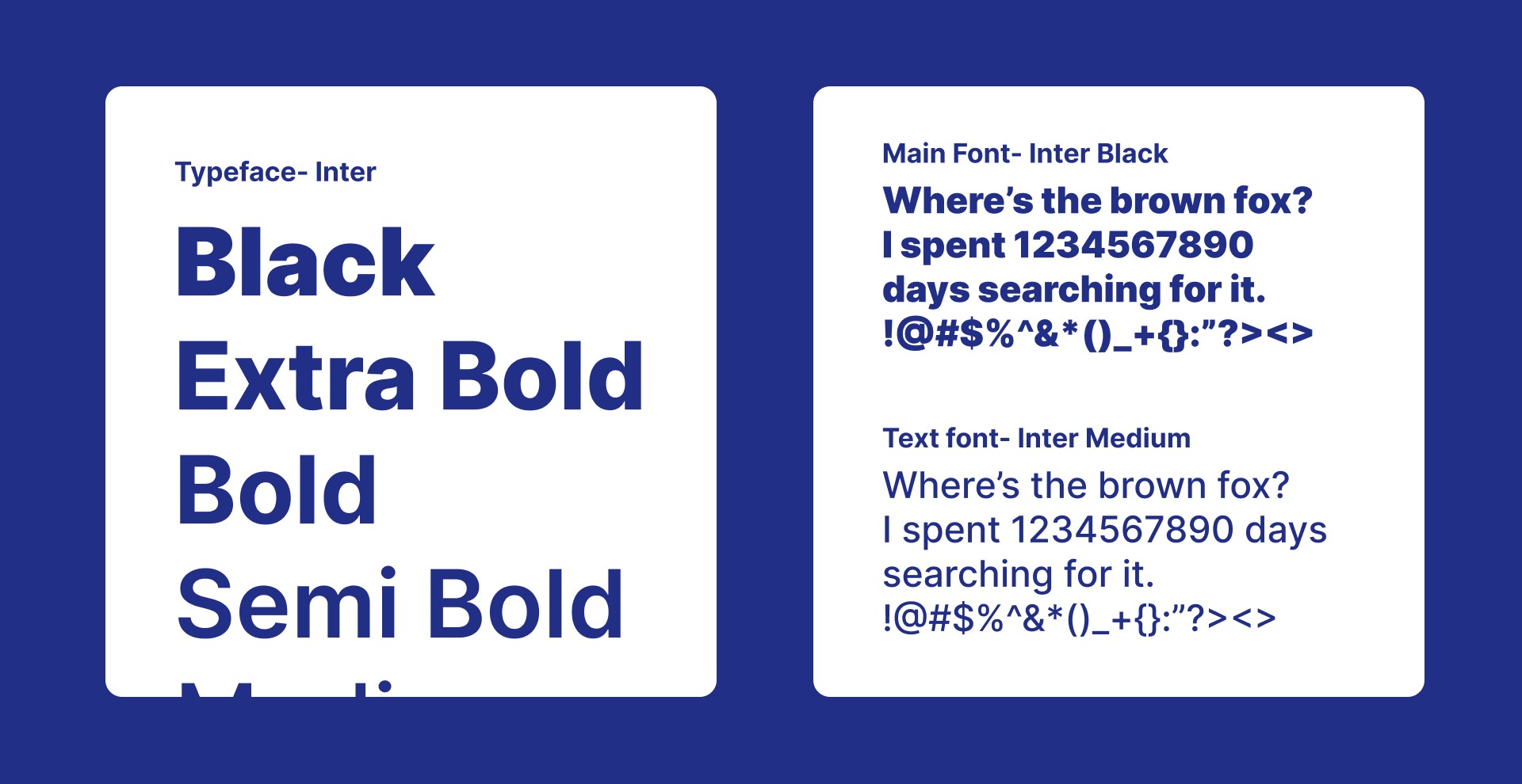
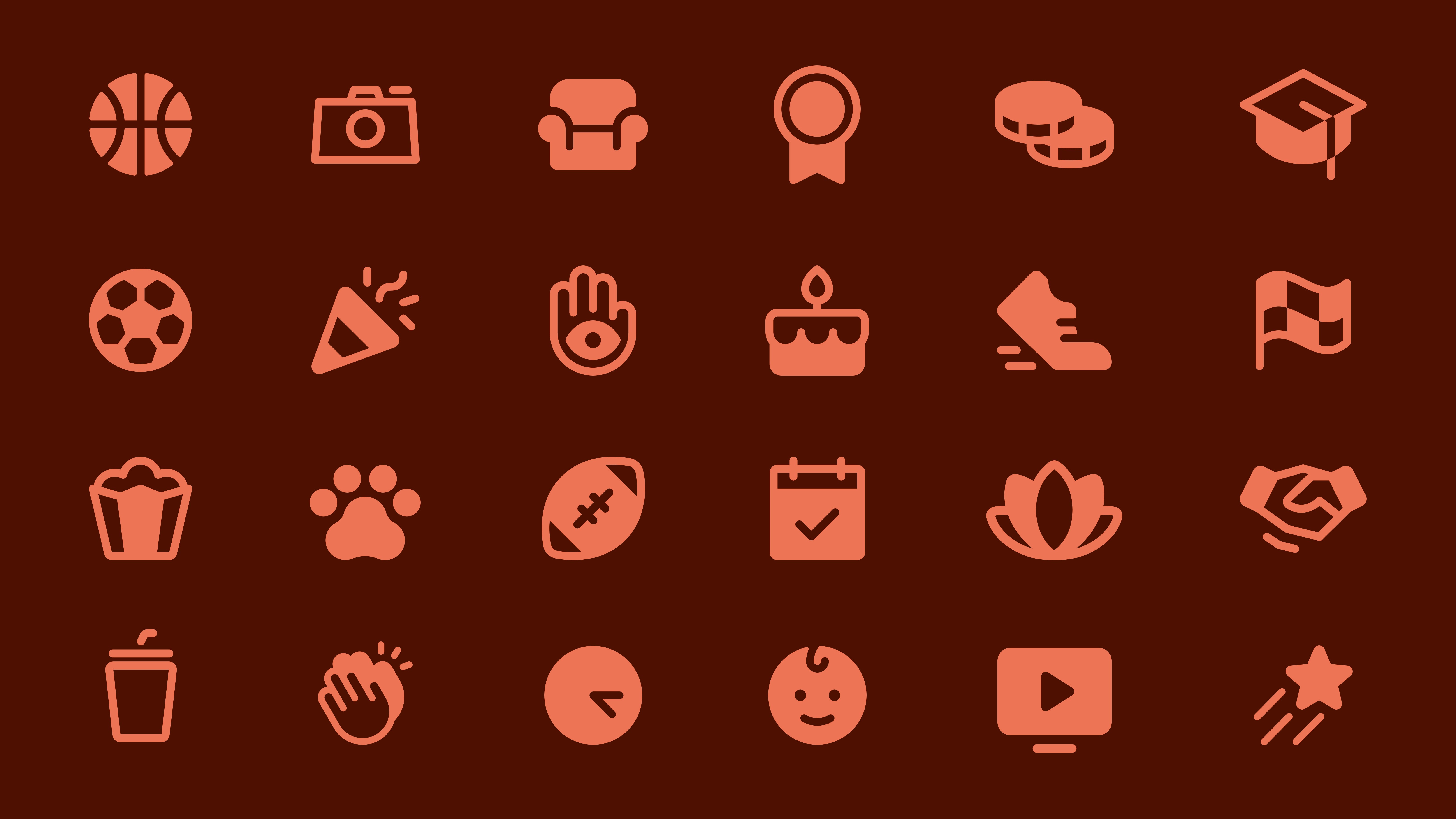
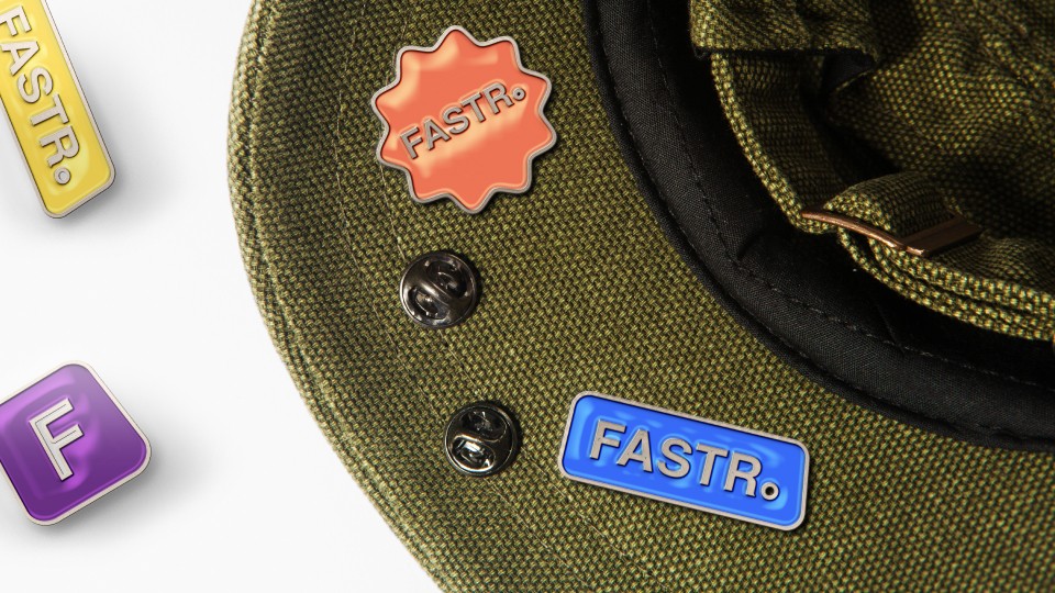
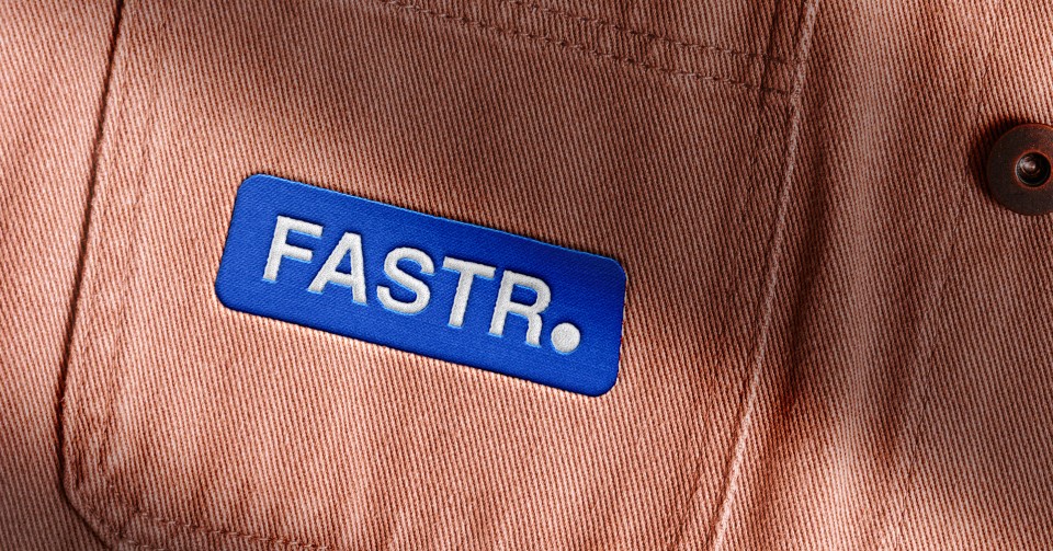
The colors had to be bright yet not harsh, the typeface needed to be cool but not corny and the icons had to be functional in both marketing and product uses.
Result
The outcome was not only a brand system that was unique in looks but also established a unique connection with the viewer because we understood them. It resulted in an instant hit among students we marketed to and also helped gather an overwhelming number of users signed up on the waitlist ahead of the product launch.
Strategy
We first began with a brand strategy session to narrow down the initial users to university students that we could instantly resonate with and then we had to find a better name for the company, finally, we delved into creating a unique visual system with quirky attributes but still grounded in the roots of professionalism.
We rounded up with creating a marketing campaign targeted at the university students and created the visuals to accompany this campaign.
Design
The underlying visual language was created with the idea of enabling transitioning quickly between being friendly and being professional.
We had to avoid straight up boring edges and also not go overboard with overly playful curves. We decided to settle on being more titled to the playful and jovial aspects but with simple curved edges and try to establish balance as much as possible.
The colors had to be bright yet not harsh, the typeface needed to be cool but not corny and the icons had to be functional in both marketing and product uses.
Result
The outcome was not only a brand system that was unique in looks but also established a unique connection with the viewer because we understood them. It resulted in an instant hit among students we marketed to and also helped gather an overwhelming number of users signed up on the waitlist ahead of the product launch.