MindControl
Building a community where It's okay to have the tough conversations.
Brand Strategy, Visual Identity System.
MindControl
Building a community where It's okay to have the tough conversations.
Brand Strategy, Visual Identity System.
MindControl
Building a community where It's okay to have the tough conversations.
Brand Strategy, Visual Identity System.
Context
Mindcontrol is an international mental health group that fosters conversations around mental health issues and offers an active, safe and open community concerning these issues, with a large number of cell groups scattered around the world, the project required creating a visual system that unifies and ties all of them together,
Strategy
The approach taken seeks to embody mental issues and depression in such a way that people that come in contact with the brand and are going through the issues tabled can instantly relate and feel a sense of belonging to make the first step of reaching out.
It was a matter of concern as to why we didn't explore a more visually exciting and colorful visual system, however, we wanted to embody the feeling that the reader would be going through at the point of reading this and make them more comfortable rather than produce a visual system that represents a utopia that people going through different mental health issues cannot relate with.

The Logo: Creating the conversations
The logo is not inherently tied to Mental health but rather is a representation of a randomizer that generates different topics that are to be discussed, these conversations are not tied to only common mental health issues but also day to day occurrences and situations that can predispose one to develop serious mental health conditions.
Typography: An expression of Inclusivity
The brand typeface is Helvetica and its variant Helvetica Neue, The choice was built on the universality of the typeface, its availability, and cross-platform functionality. The major challenge lies in the use of the typeface to achieve a unique visual outlook, The use of the different font weights to signify the demographic the topic of the discussion applies.
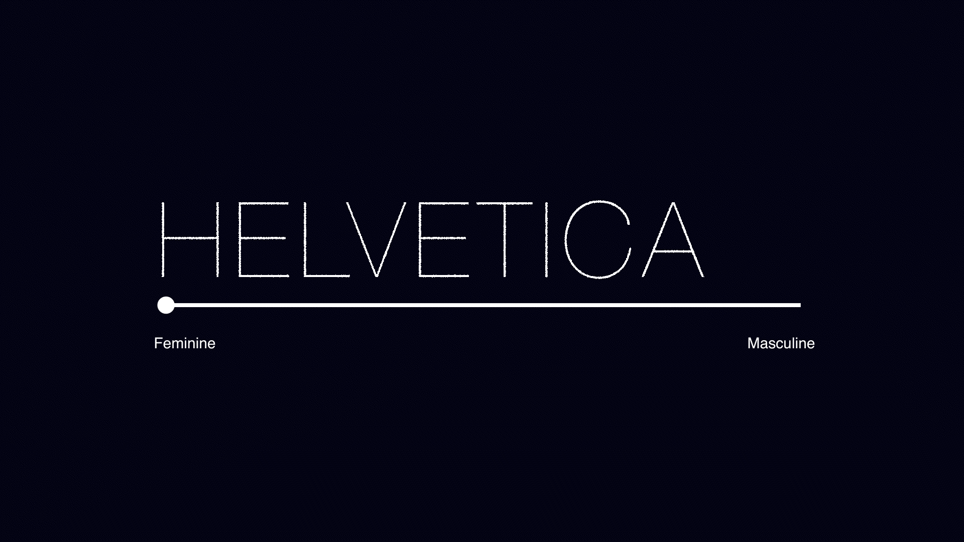
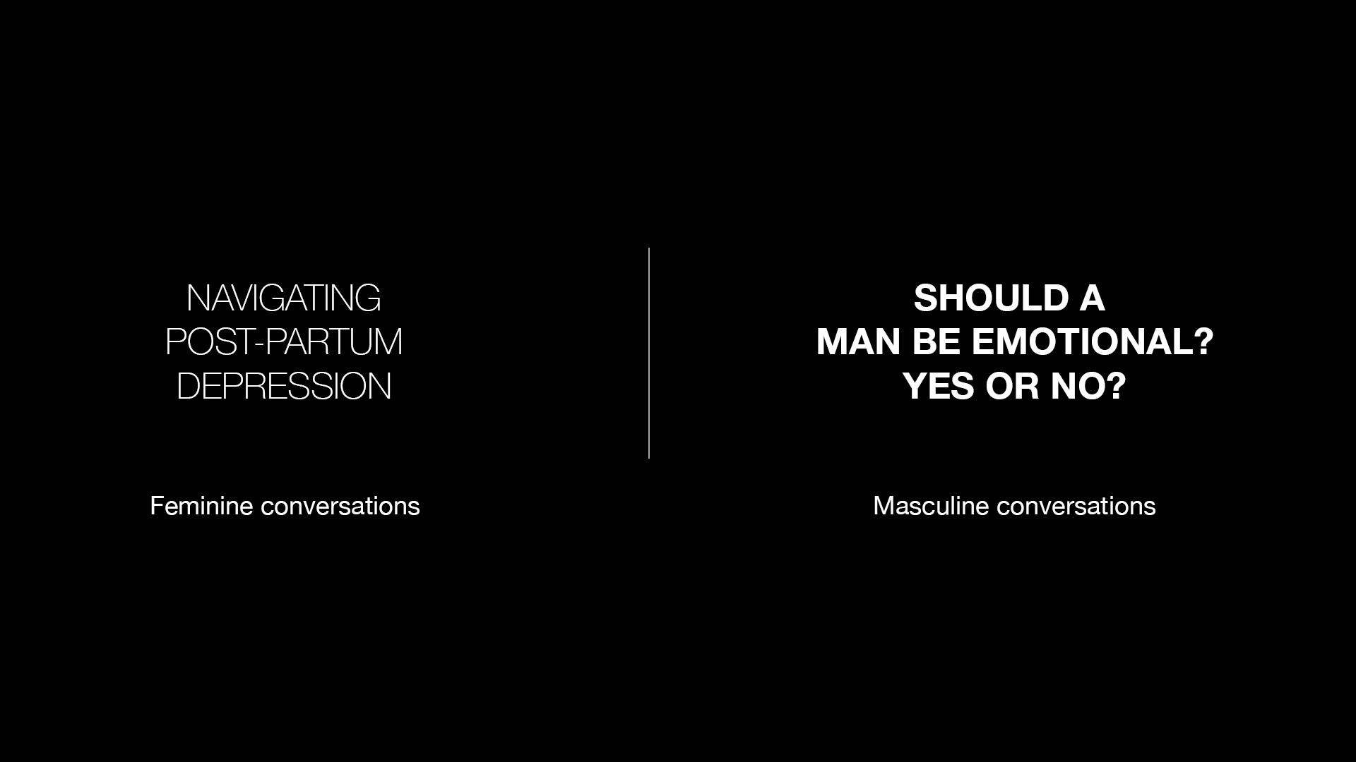
The slender, fashionable "Ultralight" weight of the typeface is used for feminine conversations, The "Regular" weight for conversations not restricted to any gender and the "Bold" weight is to be used for conversations that are specific to masculine conversations. Also the use of a fluid type system from "ultralight" to "bold" within one sentence is to be used for all-around inclusivity to encompass the different sections and people that fall between this line of masculine and feminine traits.
The slender, fashionable "Ultralight" weight of the typeface is used for feminine conversations, The "Regular" weight for conversations not restricted to any gender and the "Bold" weight is to be used for conversations that are specific to masculine conversations. Also the use of a fluid type system from "ultralight" to "bold" within one sentence is to be used for all-around inclusivity to encompass the different sections and people that fall between this line of masculine and feminine traits.
The slender, fashionable "Ultralight" weight of the typeface is used for feminine conversations, The "Regular" weight for conversations not restricted to any gender and the "Bold" weight is to be used for conversations that are specific to masculine conversations. Also the use of a fluid type system from "ultralight" to "bold" within one sentence is to be used for all-around inclusivity to encompass the different sections and people that fall between this line of masculine and feminine traits.
The slender, fashionable "Ultralight" weight of the typeface is used for feminine conversations, The "Regular" weight for conversations not restricted to any gender and the "Bold" weight is to be used for conversations that are specific to masculine conversations. Also the use of a fluid type system from "ultralight" to "bold" within one sentence is to be used for all-around inclusivity to encompass the different sections and people that fall between this line of masculine and feminine traits.
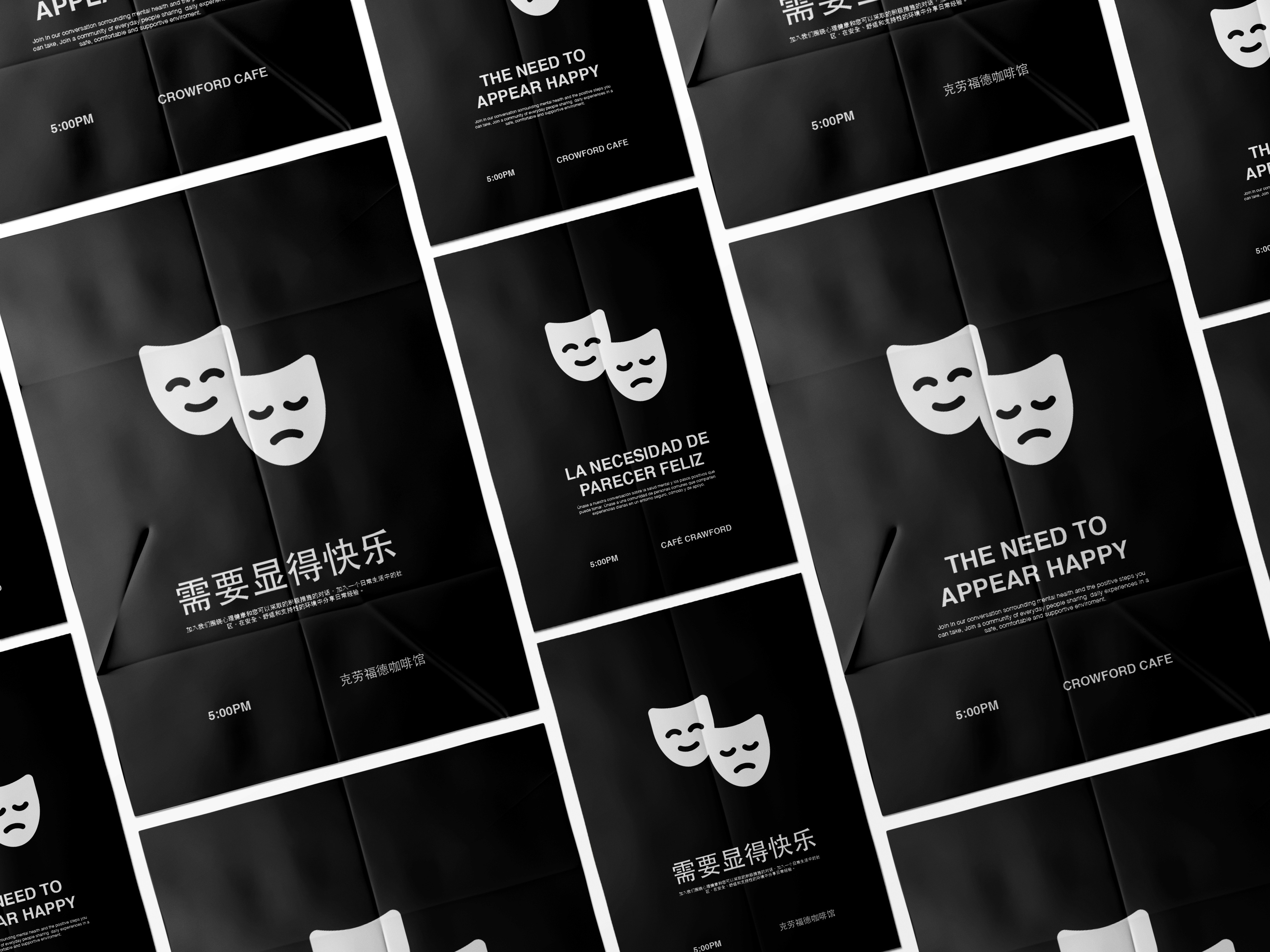
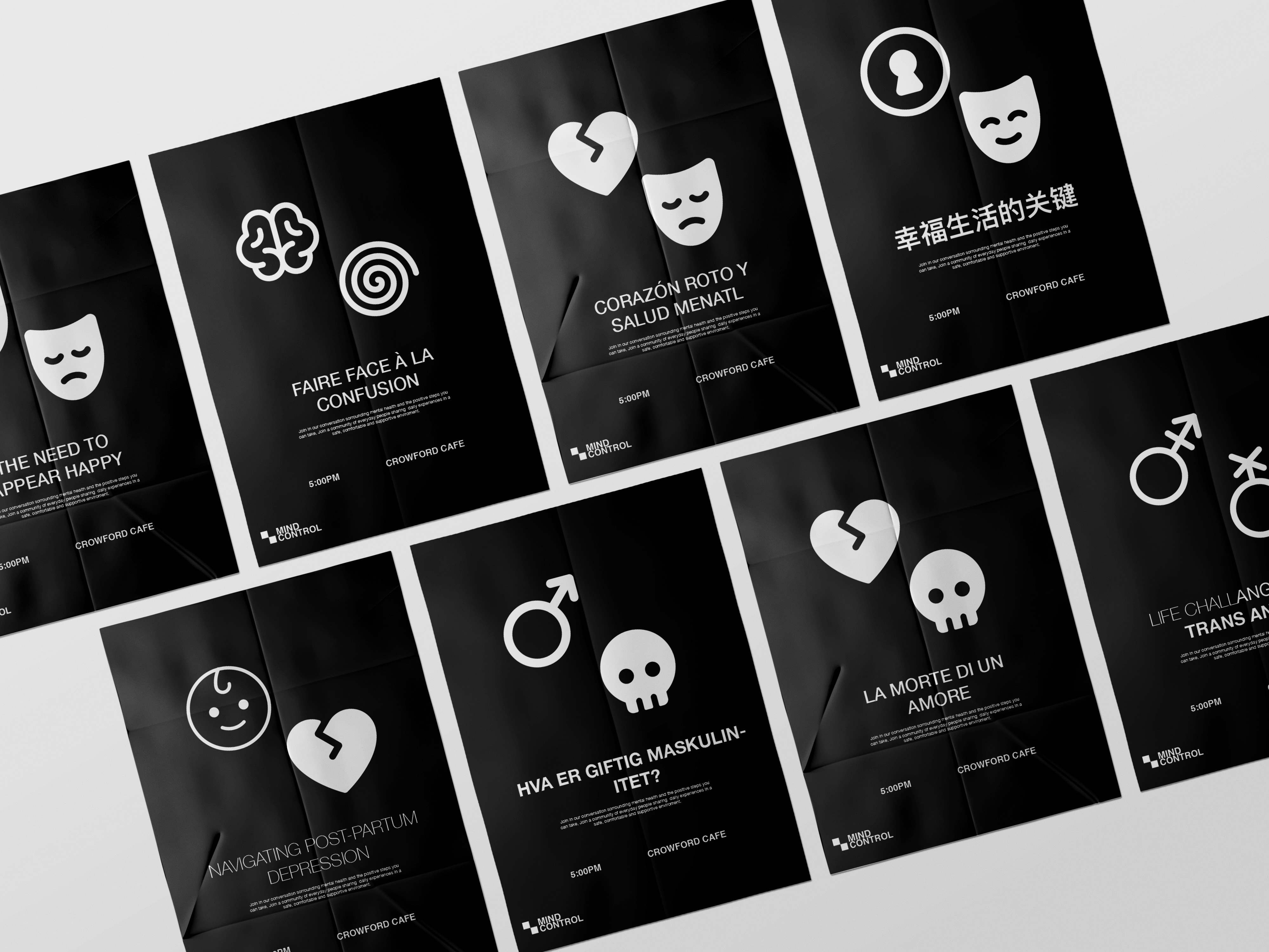
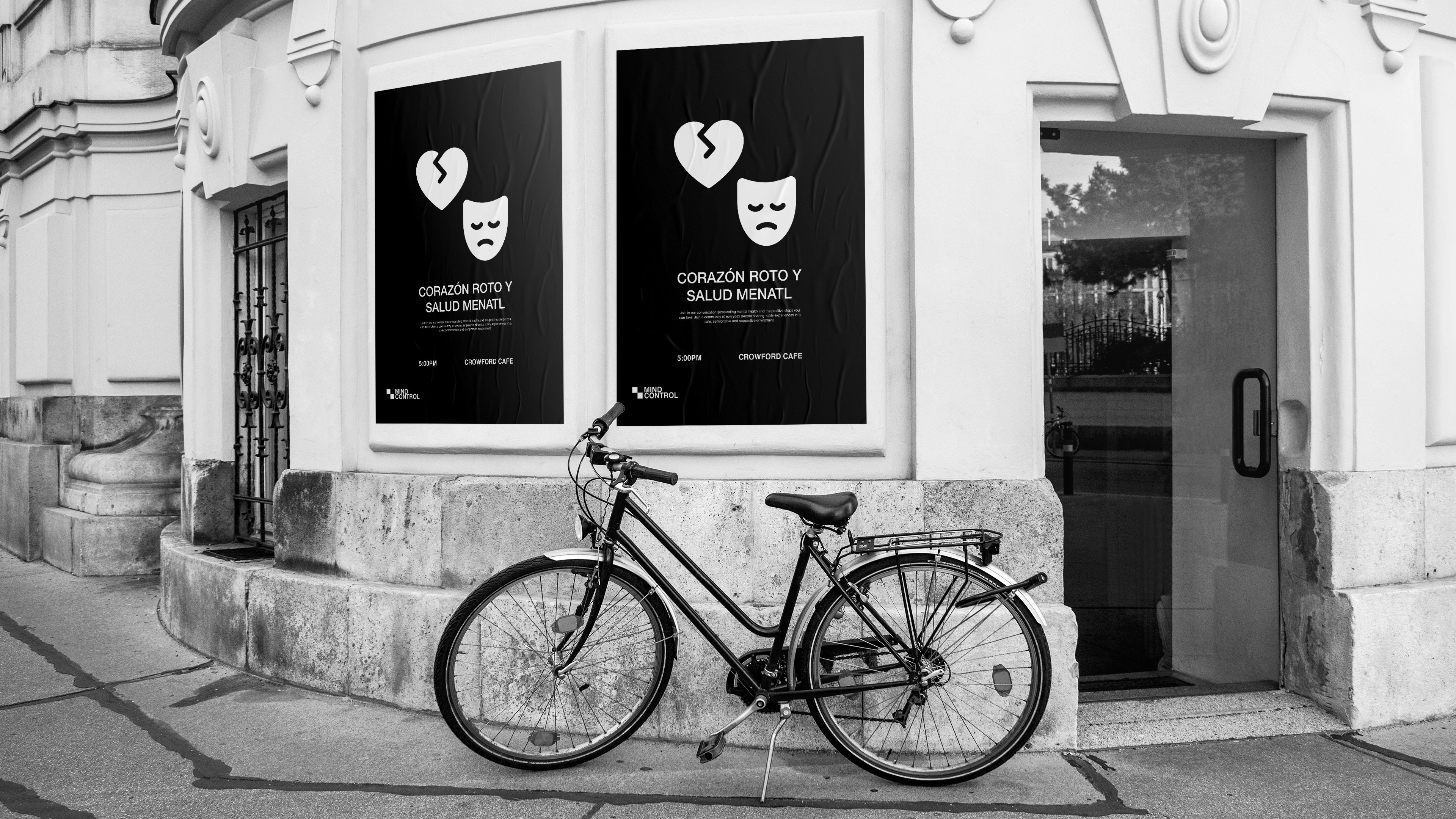
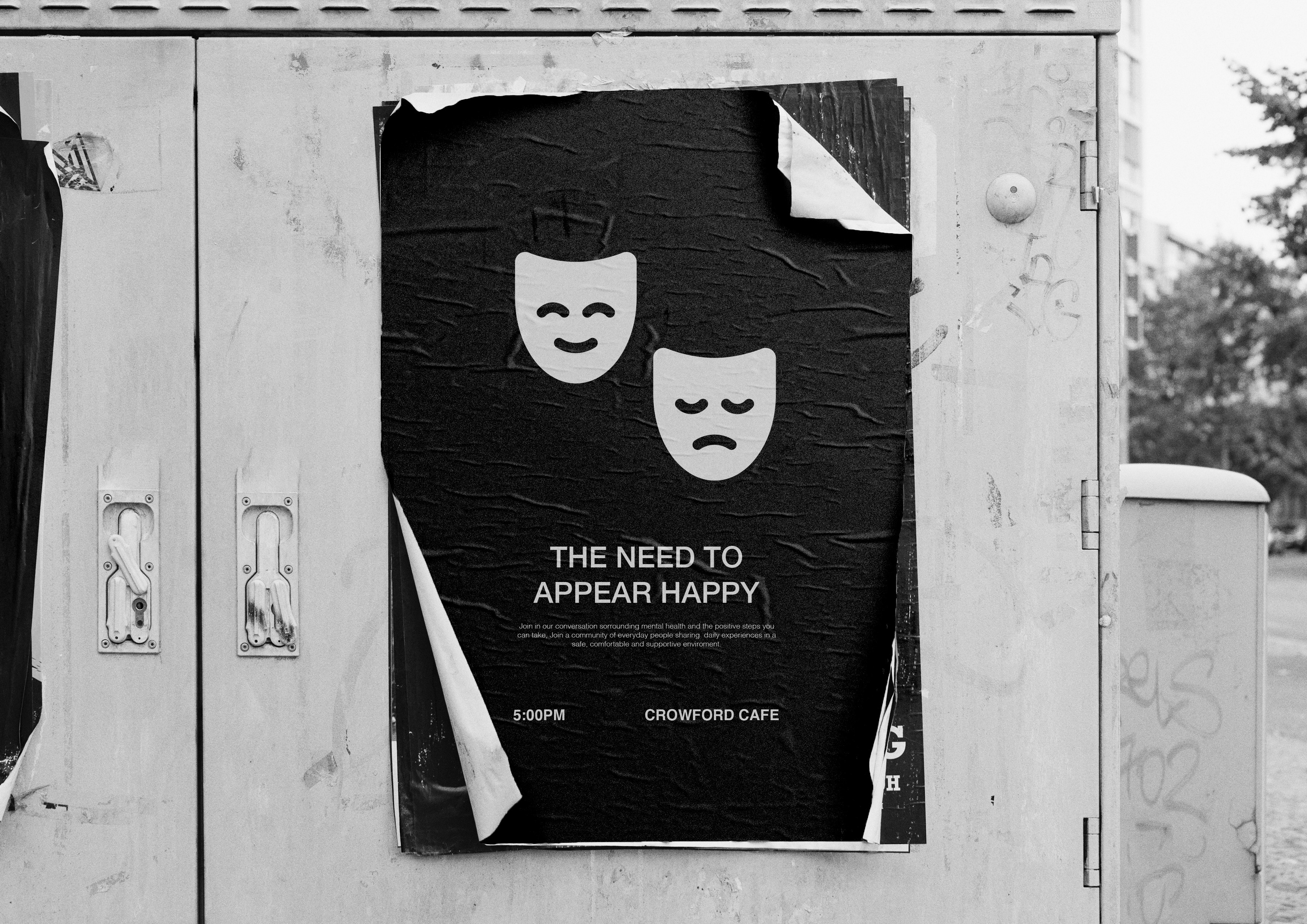
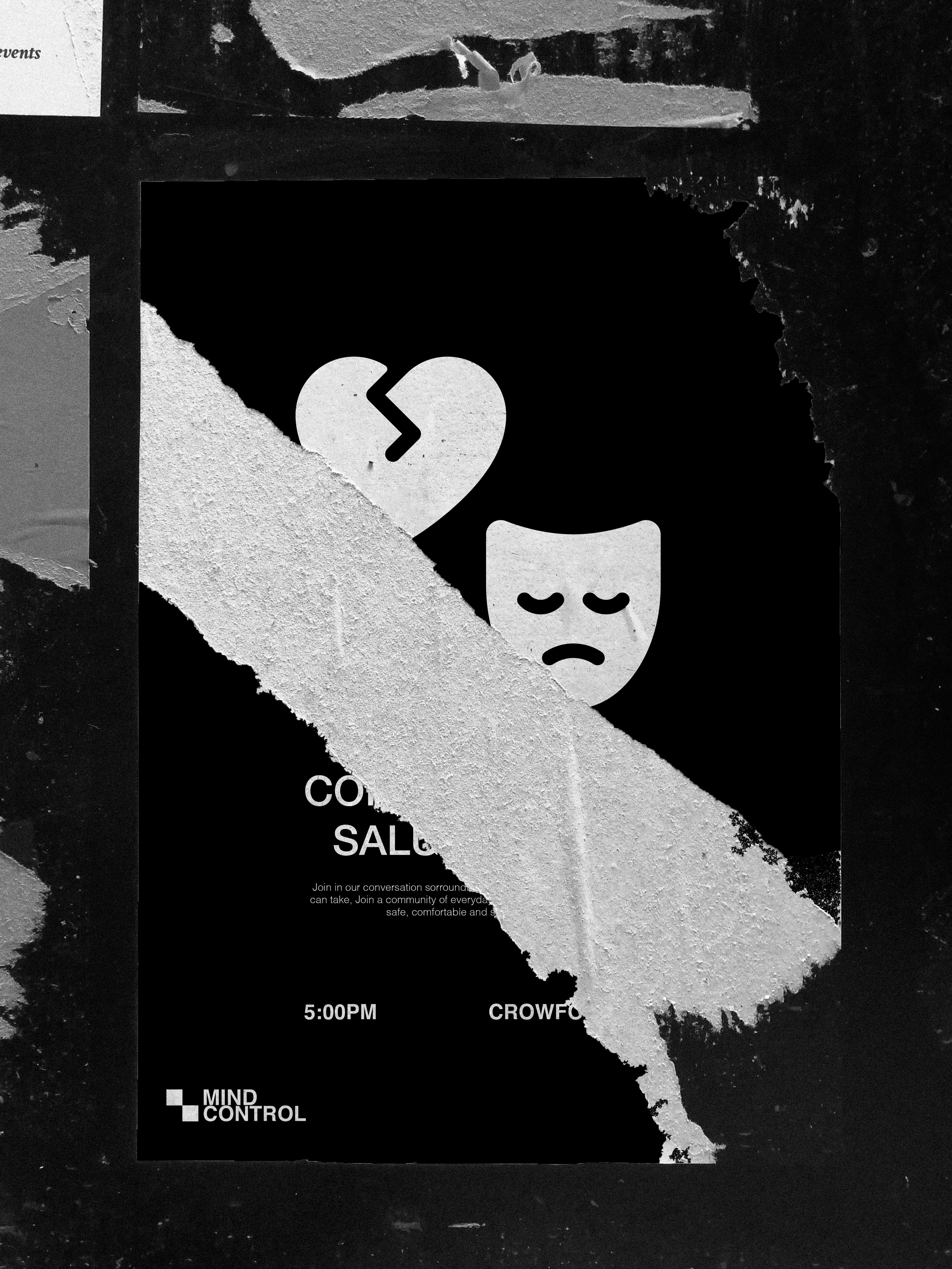
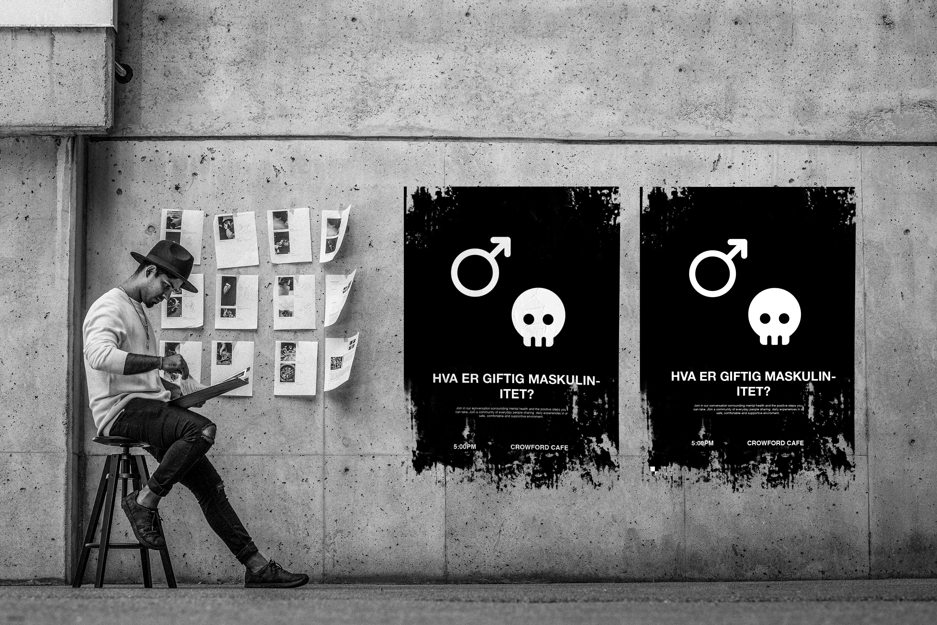
Posters: Visualising Mental Health Concerns
A huge part of the marketing of the organization relies on the use of posters, to create a unique visual system we relied on the randomizer of the logo to generate the icons set for each topic accompanied by the appropriate use of typography settings. This helps the organization recreate the same visual language in different cultures, countries, and languages without the need for extensive modification. As part of the support files over 200 icons were prepared ahead for the various use case the organization could have with a template and guideline on how to recreate new icons when the need arises in the future.


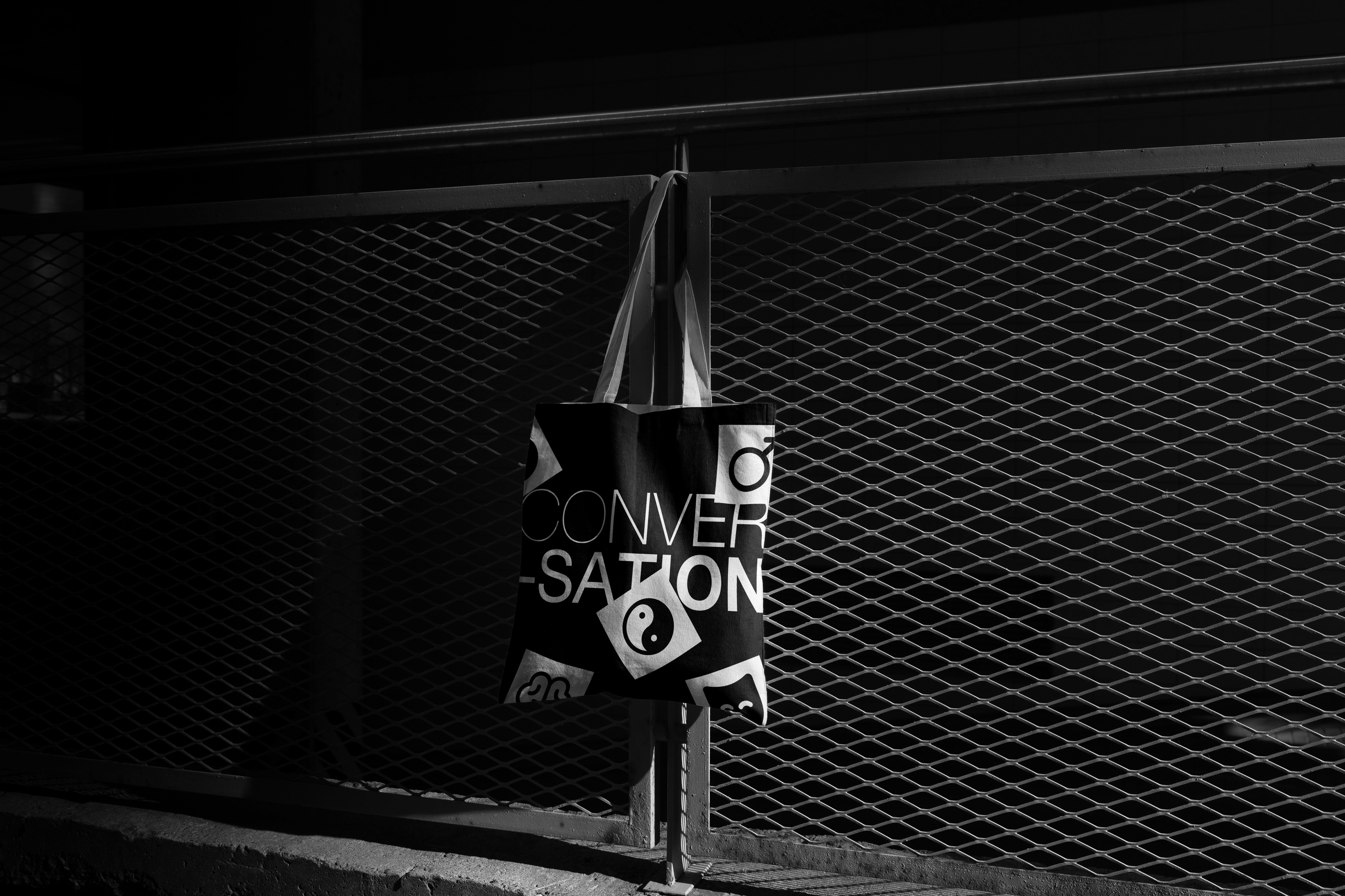
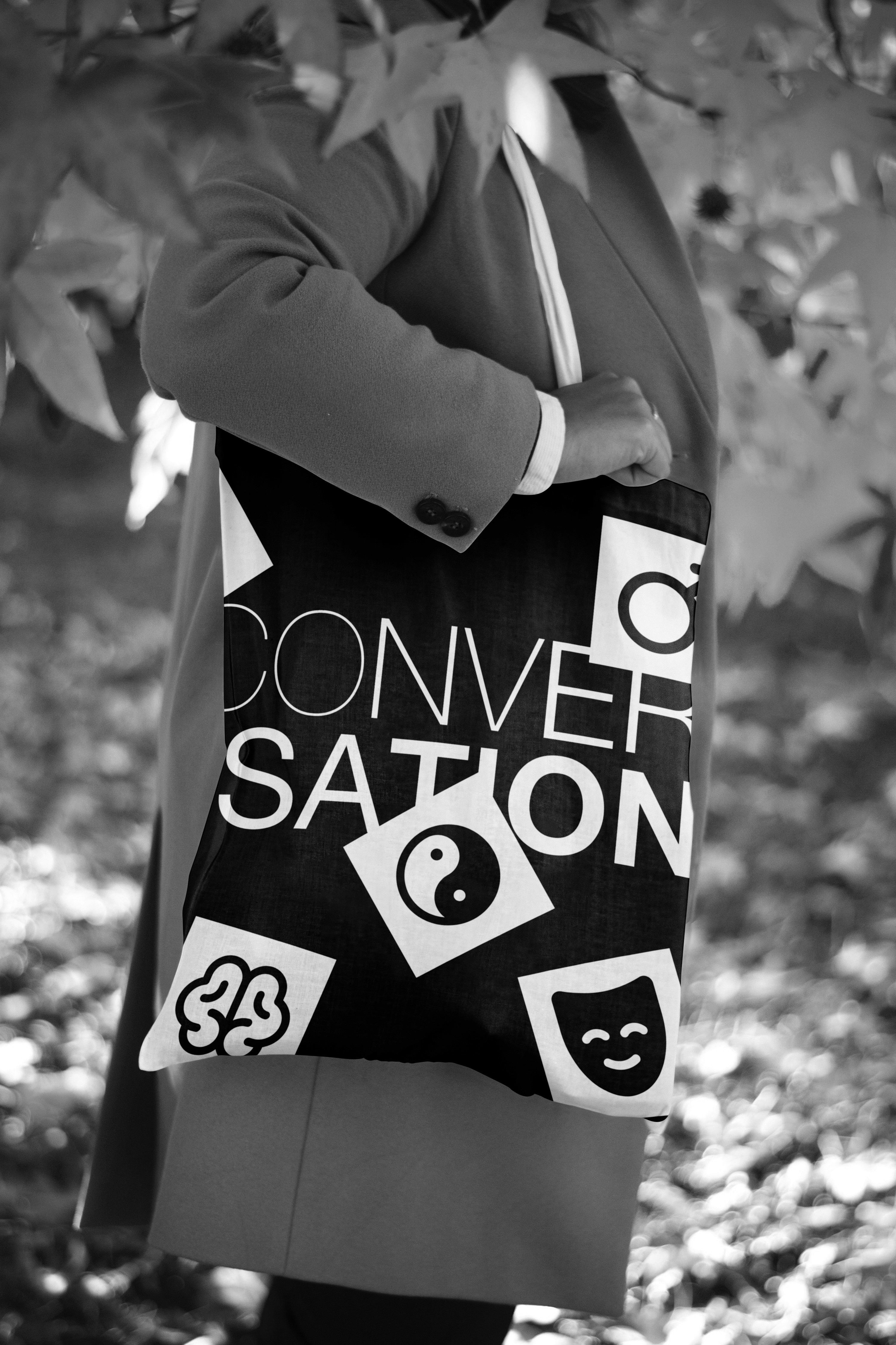
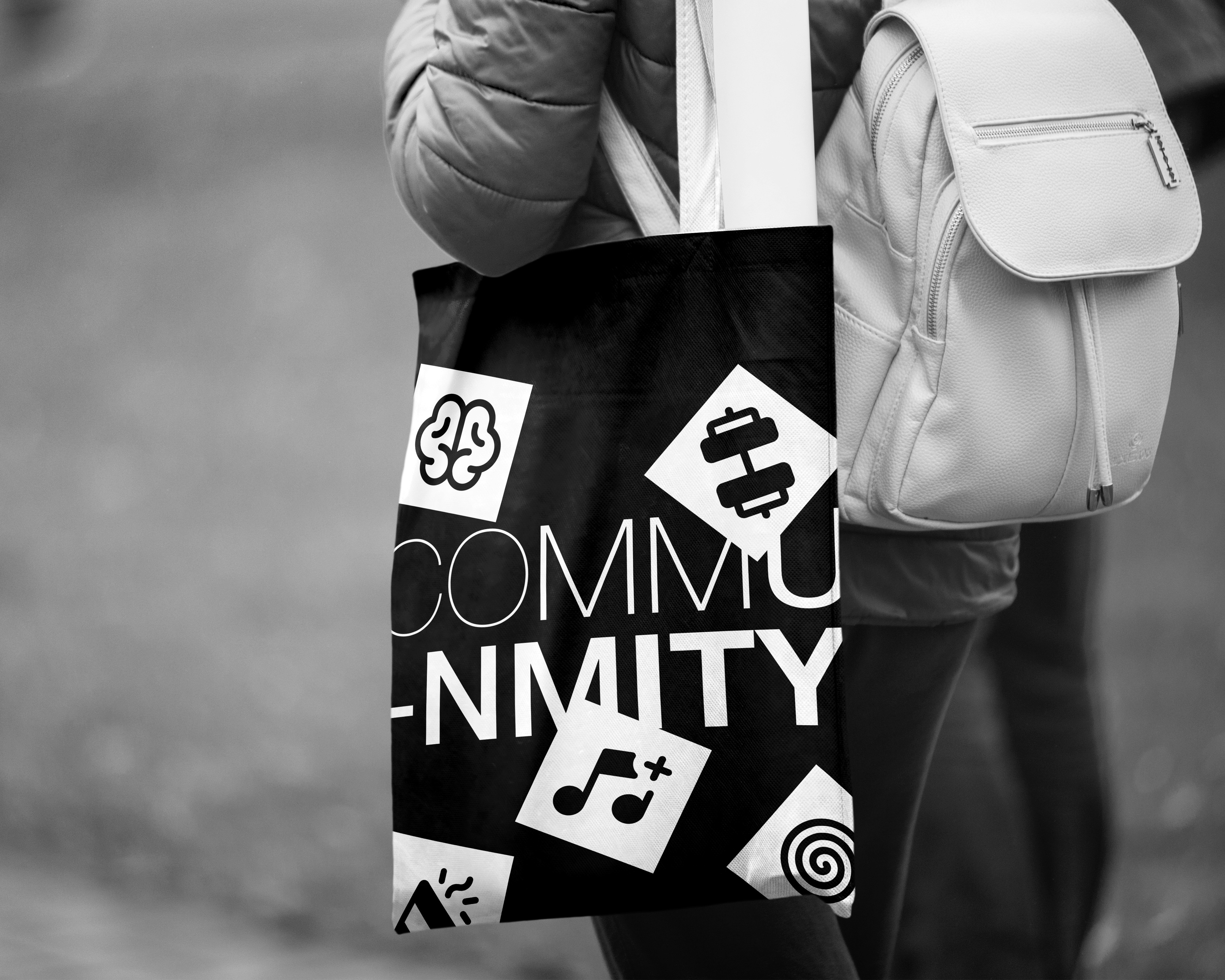
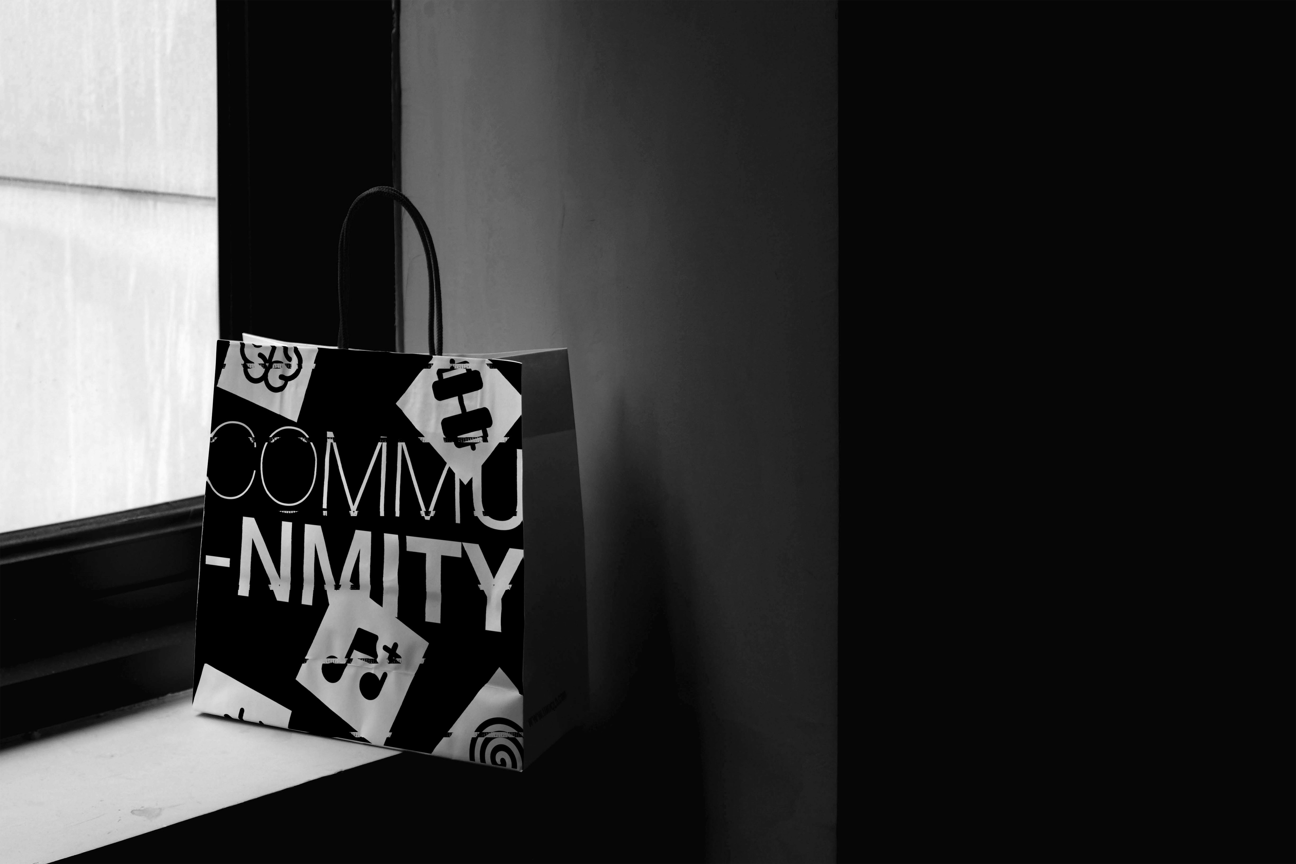
The Merch Bags.
The bags were designed with 2 major purposes, to be inclusive and to foster the first conversation with the use of the fluid type system with more expressive use of the Icons to create a distinctively urban, eye-catchy, and modern visual language that is visually appealing and at the same time simple enough, this way more bags can be created and each can have its separate set of designs without the need to overly depend on the logo for identification,
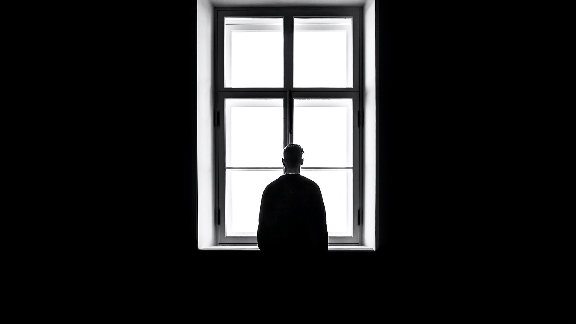
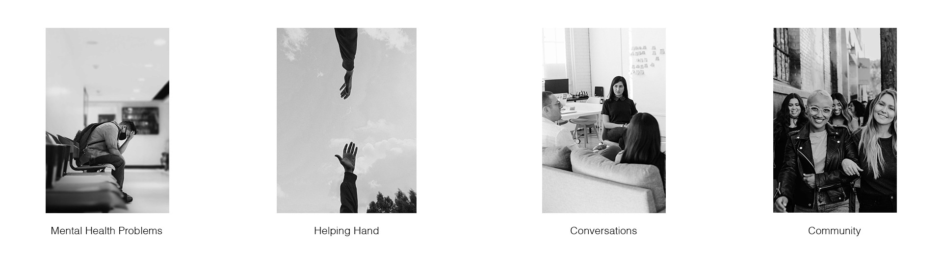
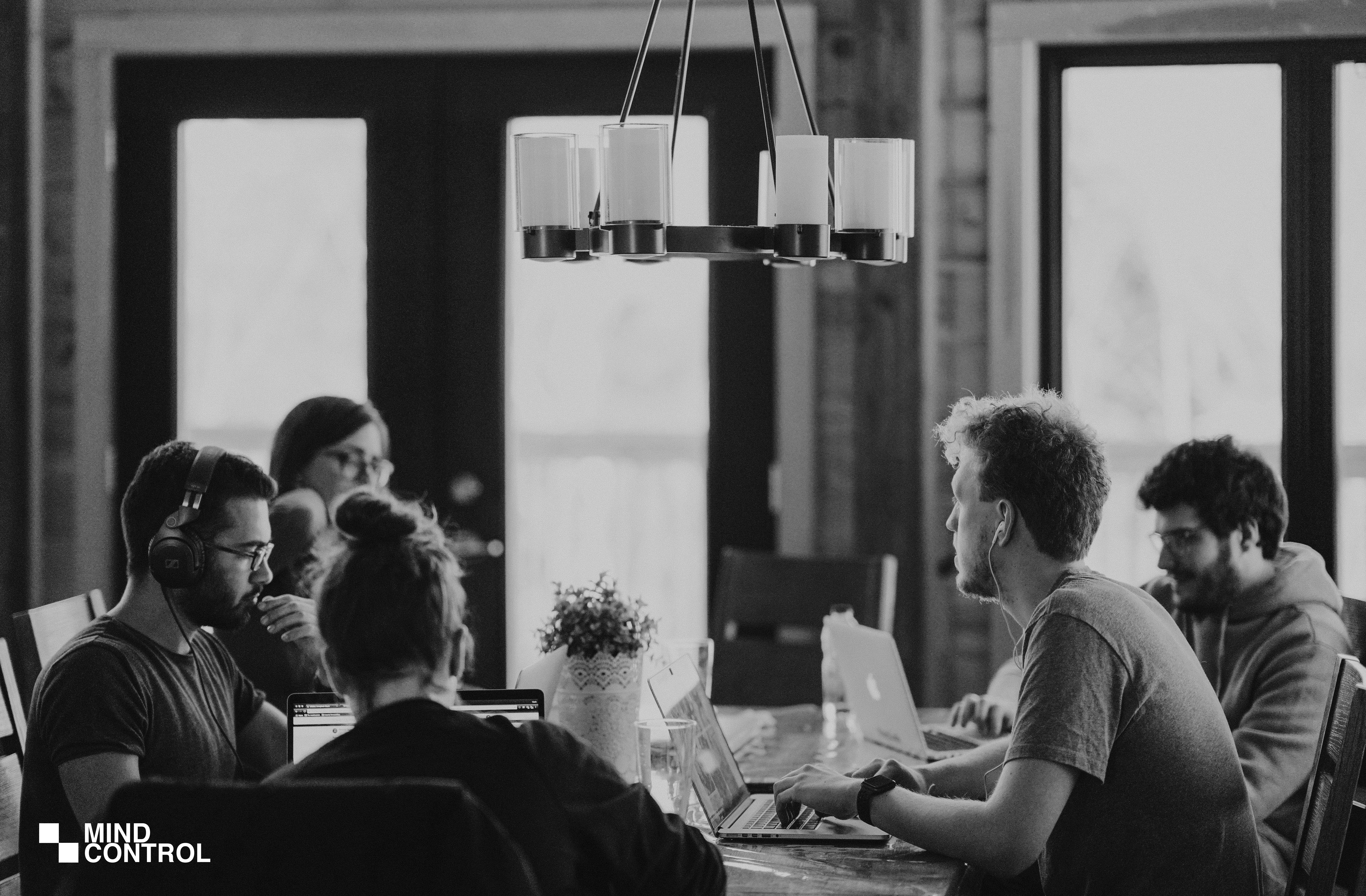
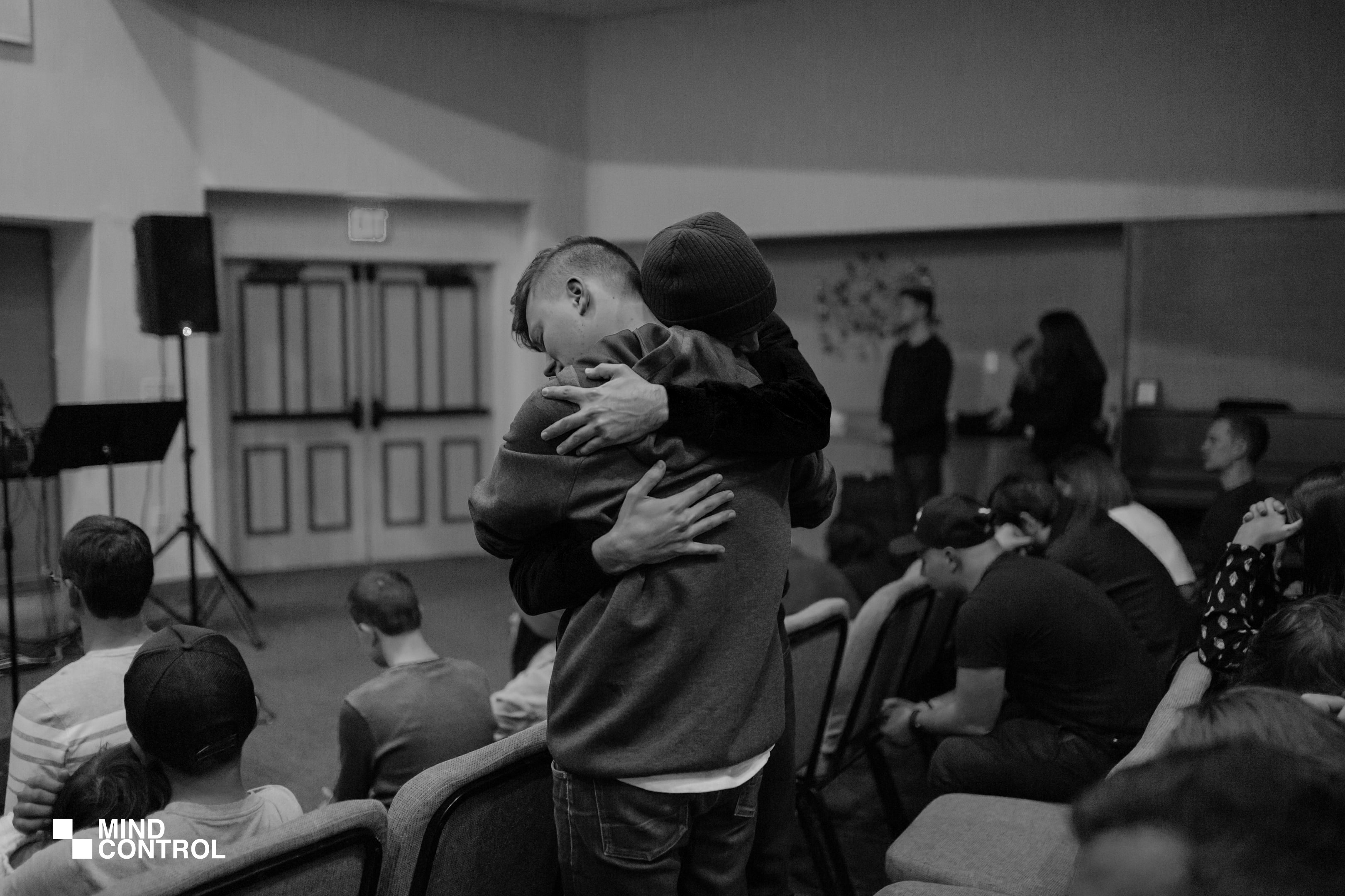
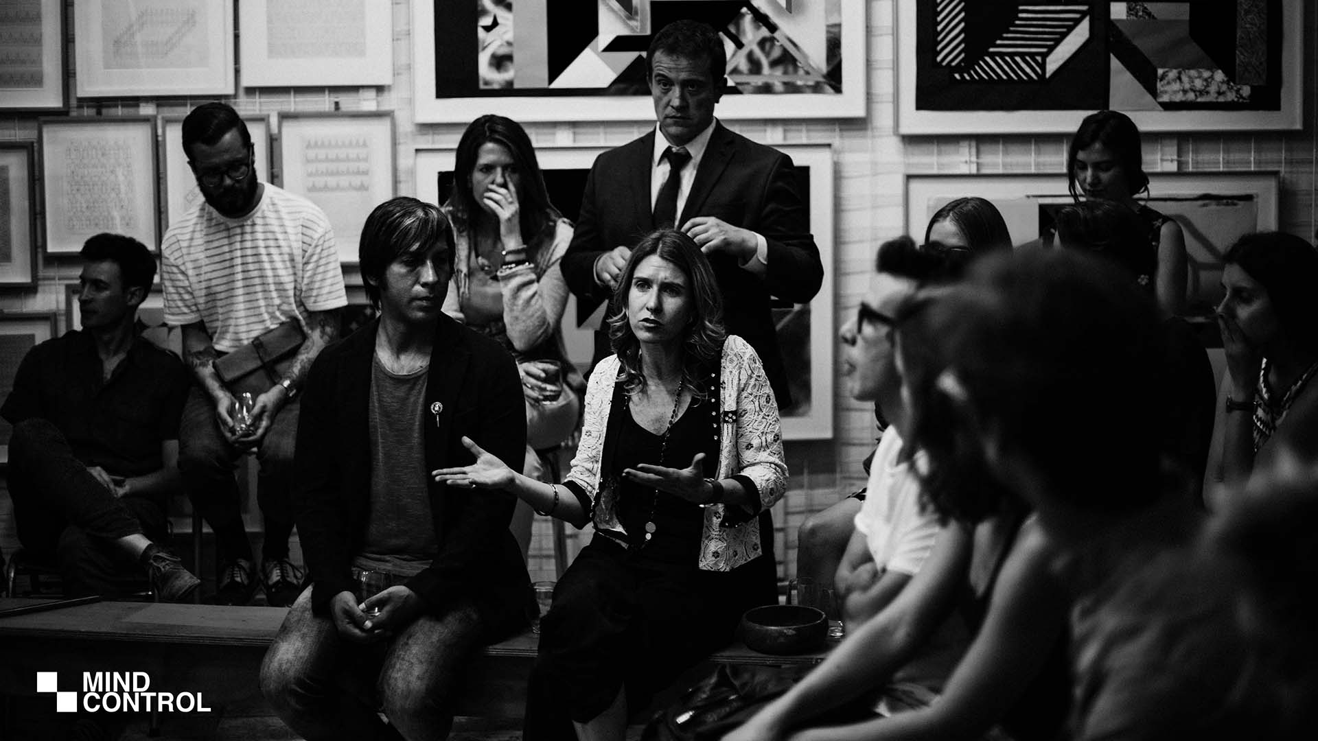
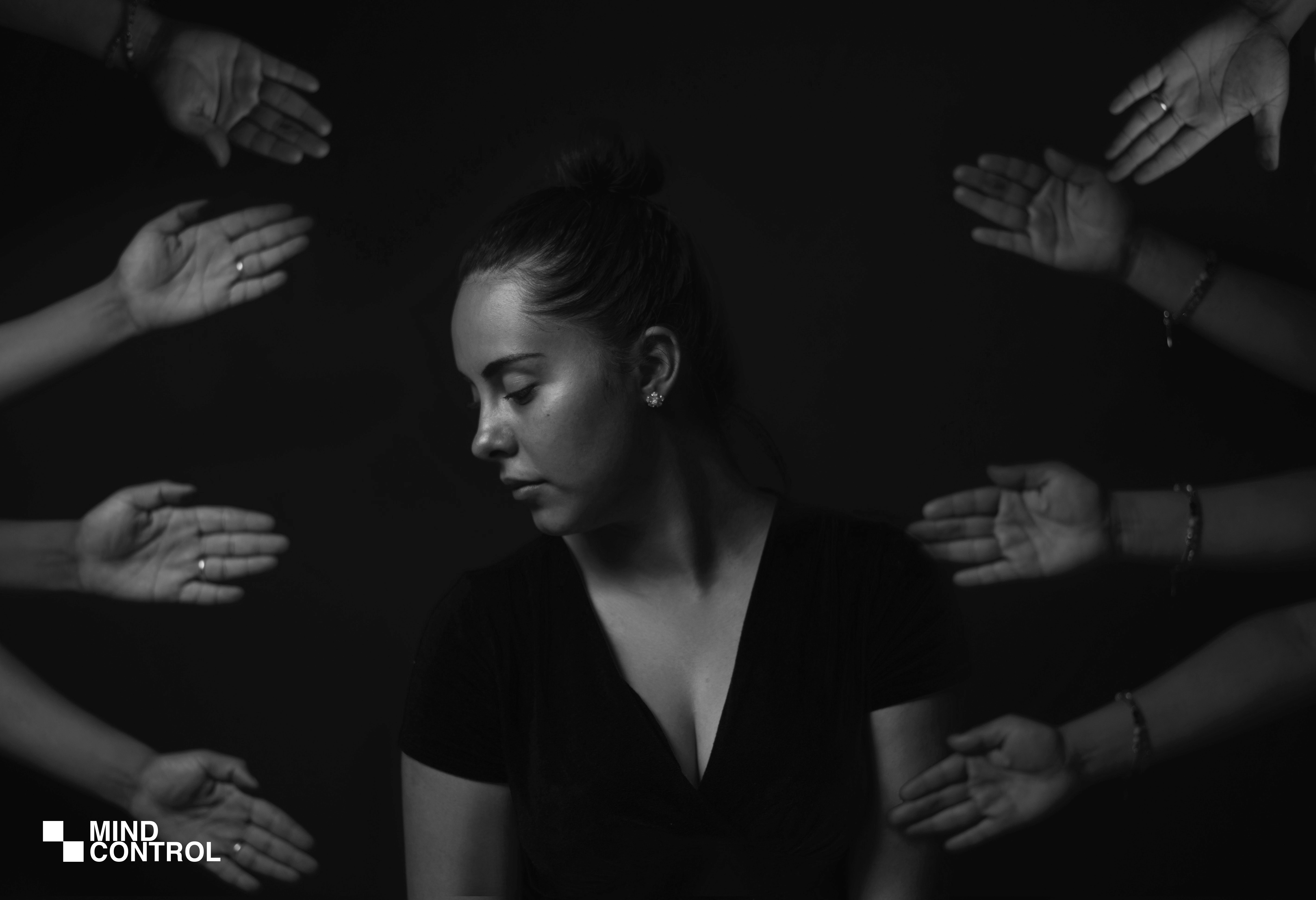
Brand Imagery.
The Images to be produced by the brand has to fit specifically into the narrative of the brand story, to achieve this we created custom settings to be applied to any image taken and to be displayed, Which was then later saved as a downloadable preset to be used on photoshop, Lightroom, and other photo editing software. The imagery style is to be professional and human which focuses more on people than other elements, This would involve the extensive use of portrait photos and community photos with the highlight on the key subject.

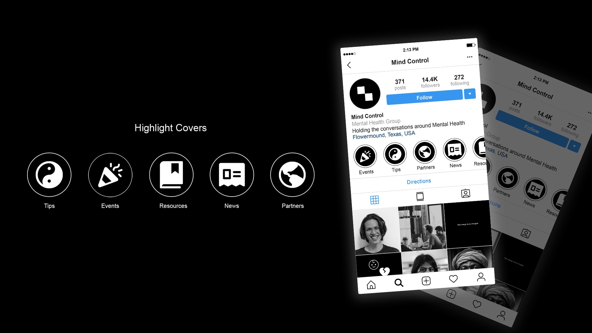
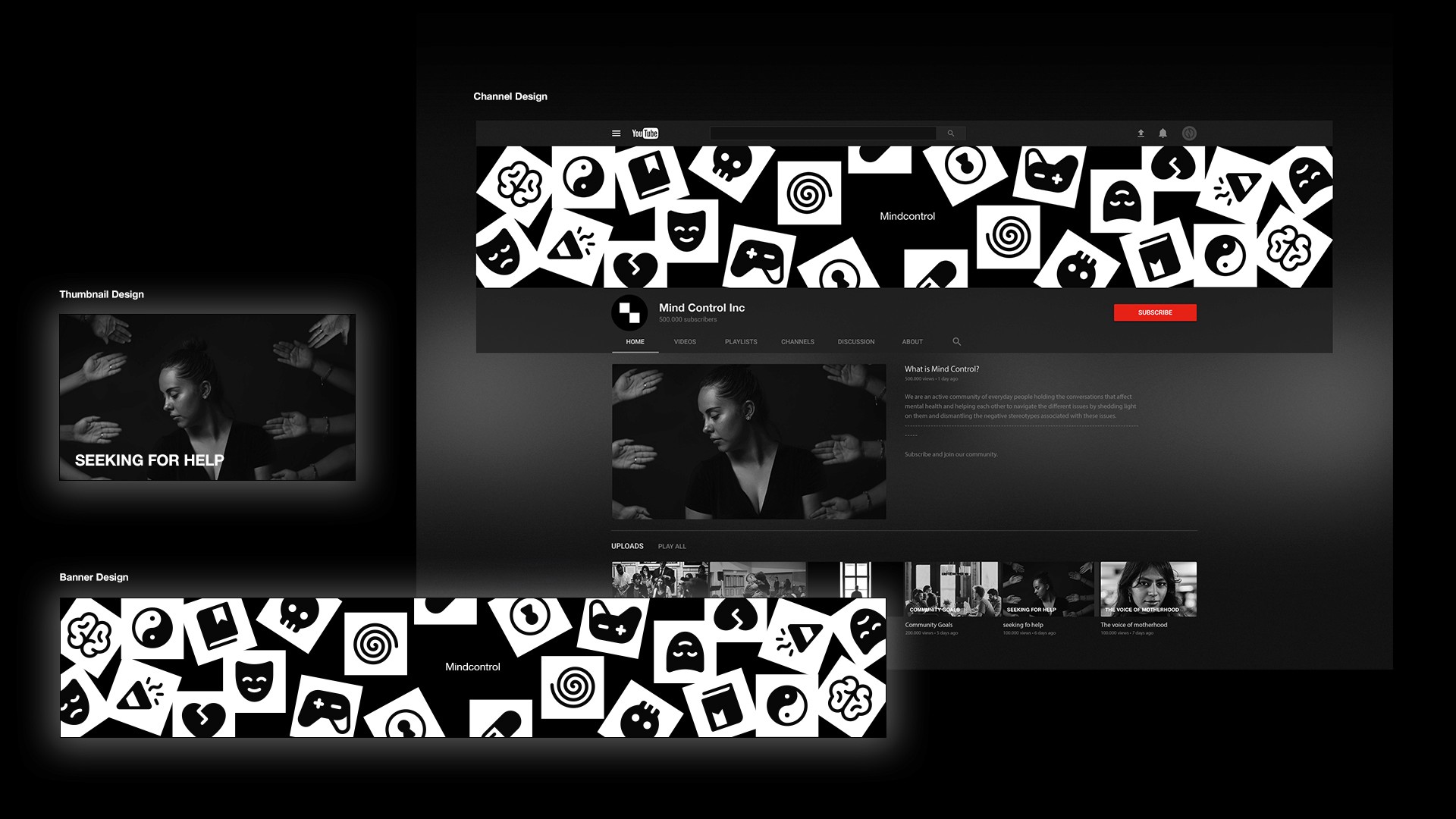
Social Media
Social Media plays an important role in the growth and communications as it will function as a major brand touchpoint for new members and the general public, to ensure that the brand assets were functional enough modified the icons to function as highlight covers for Instagram and also we collaborated with some AR designers to create Instagram filters to interact with the target audience.
The Youtube channel of the brand also had to be given special attention with clear guides on how to mix brand imagery and typography to achieve the desired design style.